
Buff Portal
Overview
The CU Boulder Buff Portal is the new student portal for all University of Colorado Boulder Students to access academic, financial, housing, and other university information. It would replace an existing portal and incorporate all of it’s functionality. The new portal was by prioritizing student feedback and web responsiveness.
My Role
I spent about two years working as a student employee on the project. I was a UX Designer and assisted with the research process. I worked with a full team of designers, researchers, developers, and business analysts.

Buff Portal was designed as a student dashboard which features “cards” grouped by content type. Each card can viewed the same on mobile or desktop with the option to expand to full screen on desktop.
DESign Process
We worked by building the portal one content section at a time. We would being with a design kickoff meeting with our team and subject matter experts. From this, we would collect our requirements and technical restraints. We would move into a design sprint where we would start with low fidelity work and then build a high fidelity prototype that would be tested with students. After collecting student feedback, we would adjust our designs, and then hand off to development.
Example : grades card
I will show my work on the Grades portion of the portal. I did this work as a redesign of an, existing design in the Buff Portal that the team decided to update to improve usability.
Background REsearch:
We looked at feedback on the existing grades card. It was difficult to navigate as links/buttons were not identifiable as clickable. Data around GPA was also confusing as not enough context was provided.
Probelm statements
How might we provide users with a. clear GPA breakdown and keep this information private
How might we provide easy access to a history of classes/grades from previous semesters
How might we give users relevant information about their current course grades
As-is scenario
Research was used to create an As-Is scenario for the current grades experience

Low fidelity design work
Low fidelity design work was done to explore options for laying out information on page

Low fidelity work focused on giving students an overview of their GPA (something they liked about the previous design), while also making relevant links more findable such as the class history feature.
high fidelity design work
After collecting feedback from the rest of the design team and developers, I moved into high fidelity designs. 2 different GPA screens were designed (showing both major and cumulative GPA or just cumulative GPA) along with a Grades History screen
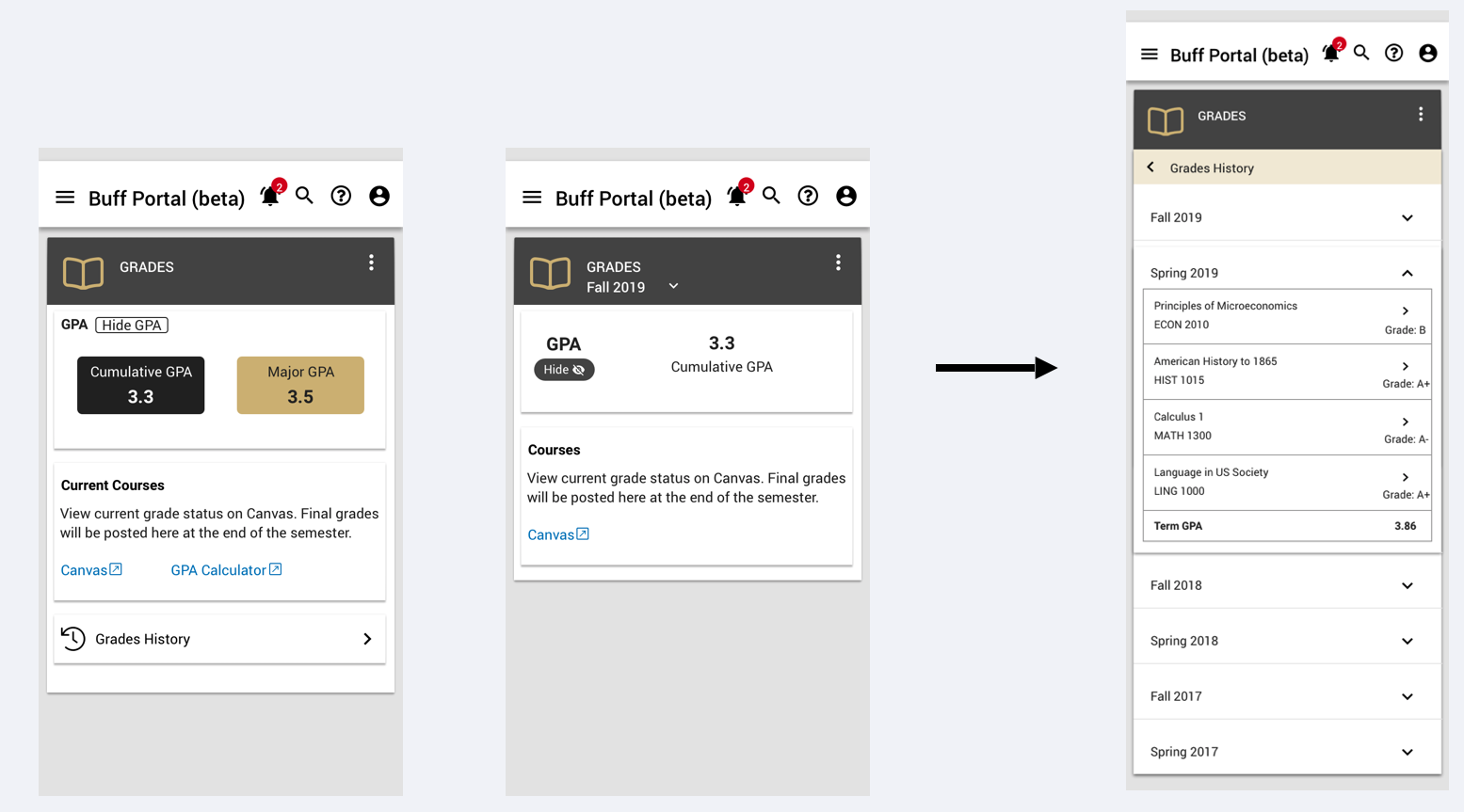
I moved forward with 2 layout options for how to show users their GPA. Each design included messaging that current semester grades could only be accessed with the schools LMS. One design also included a more prominent link to the grades history page while the other kept this in an overflow menu.
User testing
Different versions of the home screen were drawn up and tested with users. A consistent “Grades History” page was also tested.
Testing Goals/Questions:
How much GPA information do users want to see on the main page?
How successful is the design at sending users to the LMS if they are looking for current grades?
Which links are most important to highlight on the main page?
How often would users need to access the Grades History page?
testing Results
Users preferred a design with a box around the GPA, and a clear link to their grades history.
Due to data requirements, we would only be able to show cumulative GPA and not major GPA.
Multiple other links were also added below the GPA for relevant academic pages that students were unable to find in the overflow menu
“Grades History” was renamed to “Class Grades” as this was more clear to users
