Application Management Portal
Overview
The Application Management Portal is a tool users access to deploy apps to internal, IBM app stores. Users fill out a form with information about their app, which is then reviewed by an admin user before the app is deployed.
My role was the UX designer for a redesign of the tool. I worked with a team of developers.
Problem
Several new fields will be added to the form to improve information in app store listings and improve security privacy practices. The form will need to be redesigned to be useable with extra fields and updated to match Carbon Design System guidance.
Existing form

The existing form was not intended to include as many fields. It also did not meet Carbon Design form guidelines to only put relevant fields next to one another horizontally. This made the form complicated and difficult to follow
Background Research
I began by conducting a survey to understand the user experience the existing form and calculate a baseline score to use for comparison after a solution was implemented. I used a UMUX Lite score as our access to users was limited and we needed a short survey to increase response rates.
UMUX LIte Score
Methods
17 respondents
Survey sent to 220 AMP users
3 questions
2 Likert scale questions
Ease of use'
Capabilities
Results
UMUX Lite Score: 75.49
Letter Grade: B
The 90% confidence interval with a 6.16 Margin of Error is between 69.33 – 81.65

User Needs
After analyzing the existing tool, conducting a survey, and working with stakeholders, I specified 3 user needs to focus on.
As an AMP user, I need a way to easily move through the form and get a sense of what information is required from me so I can efficiently complete the form with the most accurate and up to date information about my app
As an AMP user, I need to understand what new information is being asked about my app and why so I can understand the importance this information and accurately collect it
As an AMP user I need a way to see the status of my app’s deployment so I can be confident I’ve successfully filled out the form
Design Planning
I worked with the development team to identify key pain points to address in the design
From here I began whiteboarding and creating low fidelity designs to address these pain points and then test those designs with users
Pain points to address:
The AMP form is too long and complicated containing many fields without clear organization to the form
Admin users have no easy, consistent way to ensure app owners and adding complete, correct information to the form
App owners aren’t always sure what information is needed from them or how to get it
Design Goal: Reorganize fields
Reorganize the form so unrelated fields would not appear next to one another horizontally
Limit the amount of fields visible on the screen at one time so users don’t become overwhelmed or lost
Keep design consistent with Carbon Design System components
Address pain points:
The AMP form is too long and complicated containing many fields without clear organization to the form
App owners aren’t always sure what information is needed from them or how to get it
Design Ideas

Tabs layout concept
Accordion layout concept
Design goal: deployment status
Clearly show the status of an app’s deployment to app owners
Create functionality for administrators to request changes to a form submission for things like security or app store listing information
Address pain points:
Admin users have no easy, consistent way to ensure app owners and adding complete, correct information to the form
App owners aren’t always sure what information is needed from them or how to get it
Design Ideas

Concept with overall deployment status listed with app name, and admin review process on right hand side.
Design goal: Change log
Create a central place in the form where updates can be tracked
Display both content of a change and its status (deployed, in progress, or rejected)
Address pain point:
Admin users have no easy, consistent way to ensure app owners and adding complete, correct information to the form
Design Ideas

Centralized change log table with expansion to show specific updates
User testing
After white boarding design ideas, collecting feedback, and then creating high fidelity mockups, I conducted user tests.
Goals/Questions:
Does changing the layout of the AMP form make it easier to read and understand?
Do app owners and admins understand how to access information after a form is submitted?
Can admin users complete a review of an app and request more information from an app owner?
Are app owners able to see when they’ve made an error with their submission and update it?
Methods
5 participants
3 platfrom admins, 2 app owners
Conducted 30 minute user tests, users were asked to interact with a prototype and complete key tasks
Results/Insights
Required fields or optional fields should be marked
Users were able to move through an accordion layout with ease
Change log should be more findable
Two different "statuses" is unclear to users
No distinction between action items for App Owners and Admins
Status should be either combined or placed together in the UI
Tasks for app owners should be clearly marked and the interface should tell them if they don't need to do anything currently
Design updates
After completing user testing and gathering feedback from the development team, design updates were made to designs to:
Adjust accordion sections and layout to match stakeholder needs
Make language changes to field names and section names to more clearly state what information is needed
Create a simplified admin review process that shows only one overall status and only notifies app owner if they need to make a change
Work with content designers to create additional help language on the form via labels and tooltips when fields are unclear
Final Designs
Redesigned features:
Overall form layout
App vetting process for admin users
App status and required actions for app owners
Change log
Actions available on app dashboard (deploy new version, cancel deployment, admin functions) brought into form page with single action button
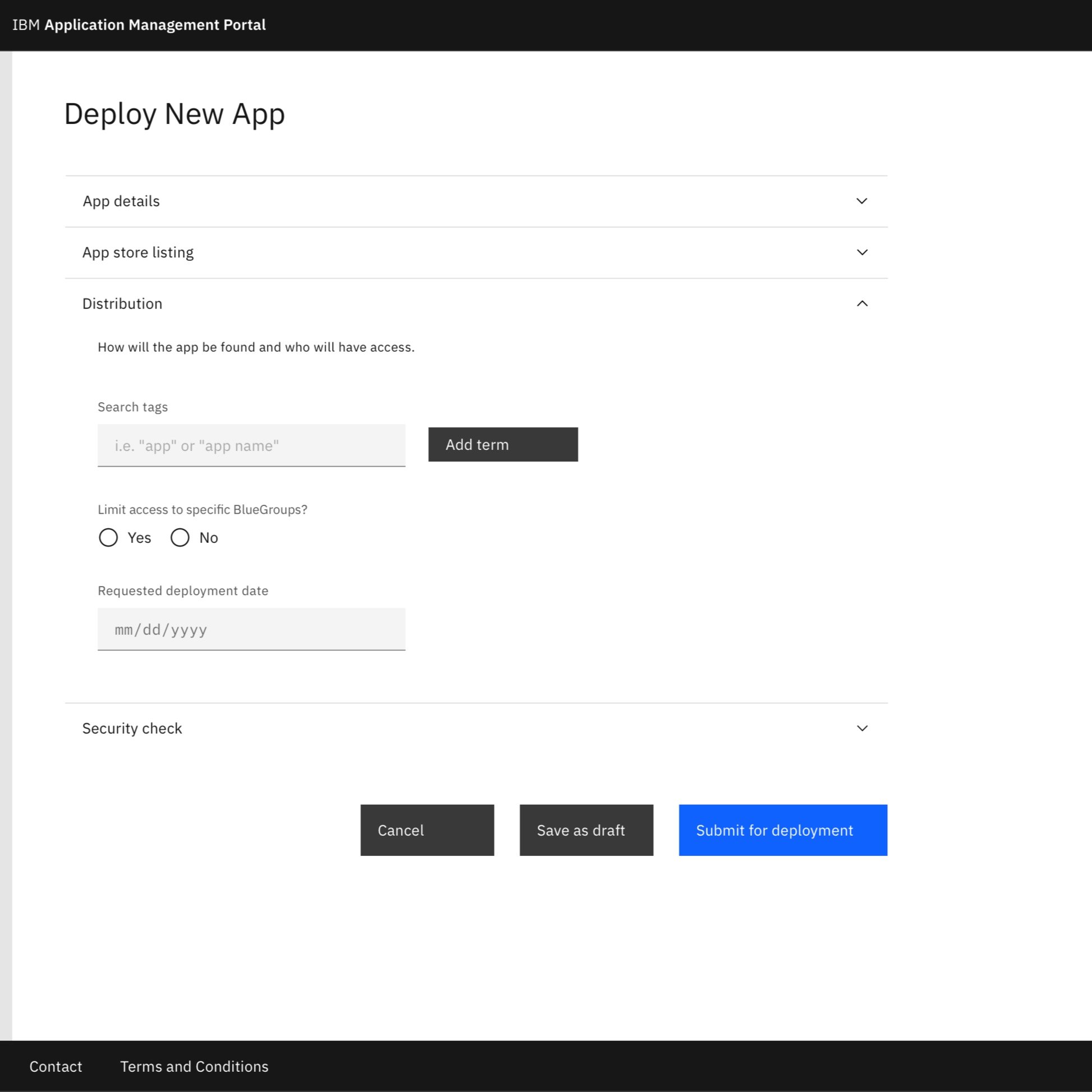
empty form
Simplified accordion allows user to move through long form without becoming overwhelmed


Filled form - app owner

Centralized action and update buttons, more visually distinct change log, and Simplified status view with “action requested” only appearing when necessary
Filled form admin

Full app vetting view for admin users only
App review

Modal accessed from admin view lets reviewers directly request information from app owners
Next Steps
Redesigns will be deployed by development team
New UMUX Lite scores will be calculated and compared to the baseline metric after deployment
Content design team will write help content to be implemented on complicated fields and create resources to help app owners create successful app store listings